
L. Creighton Dinsmore: experienced graphic designer and design educator
BRANDING
General Electric Corporate
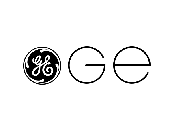
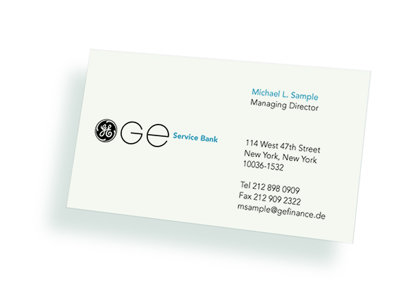
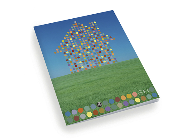
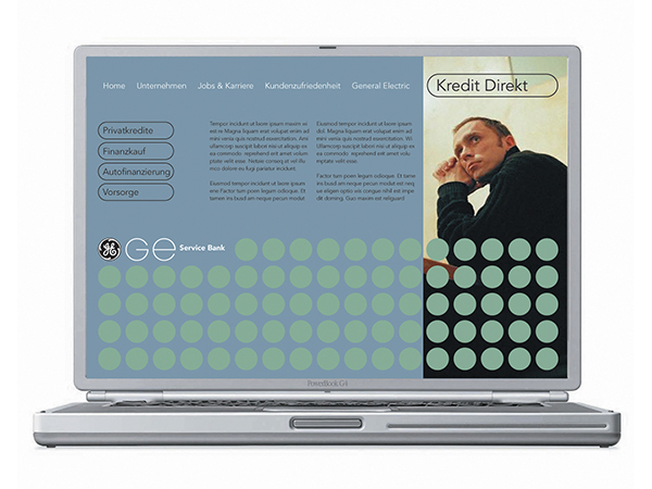
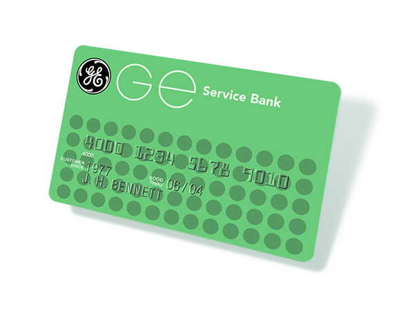
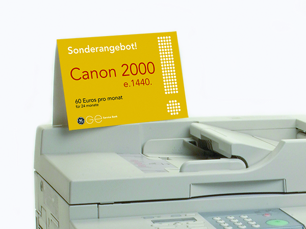
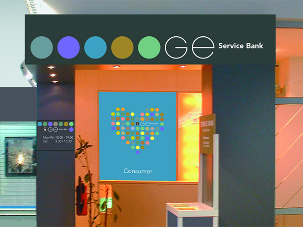
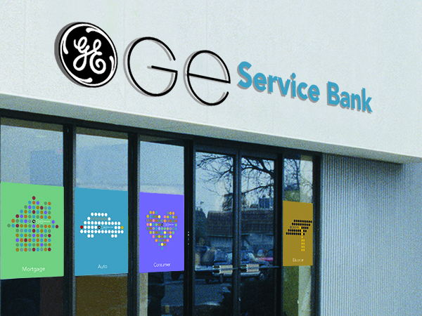
GE, a brand identity that has been around for over a century, found that the letters in the symbol were difficult to read in certain countries and cultures. Modern, circular letterforms were developed along with an identity system and circular pattern based on the symbol itself to improve legibility and to provide a dynamic yet flexible system for all applications.